Introduction
When using stat_summary() it transforms all
the values first and then calculates the summary.
However, I would like the stat_summary calculated on the original data and
then transformed.
Below I’ll try and illustrate the problem, and propose a work-around.
Note: it appears my github issue has been closed.
ggplot2::stat_summary
ggplot2 has the ability to summarise data with stat_summary. This particular Stat
will calculate a summary of your data at each unique x value.
The following creates a scatter plot of some points with a mean calculated
at each x and connected by a line.
Note:
- the true mean at
x=0is 1 - the raw
plot_dfdata and the manually calculatedmean_dfsummary are included in the appendix at the end of this post.
p <- ggplot(plot_df, aes(x, y)) +
  geom_point(alpha=0.4) +
  stat_summary(fun.y = mean, geom='line') +
  scale_y_continuous(breaks=1:9) +
  theme_bw() +
  ggtitle("Using stat_summary to draw a mean line\nNote that mean is 1 at x=1")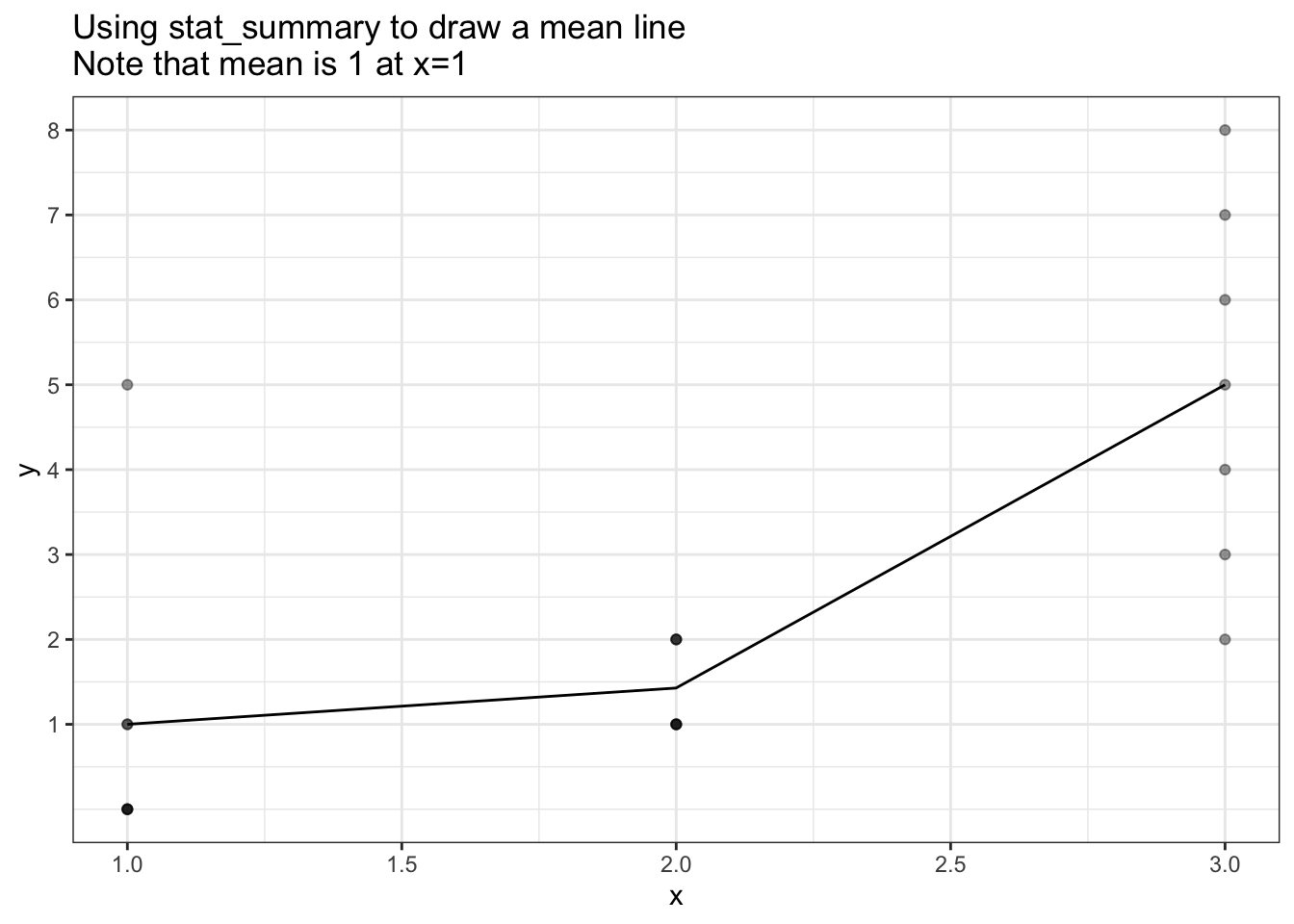
p + scale_y_sqrt(breaks=1:9) +
  ggtitle("Using stat_summary to draw a mean line - `scale_y_sqrt()`\nNote that mean at x=1 is no longer 1 !!")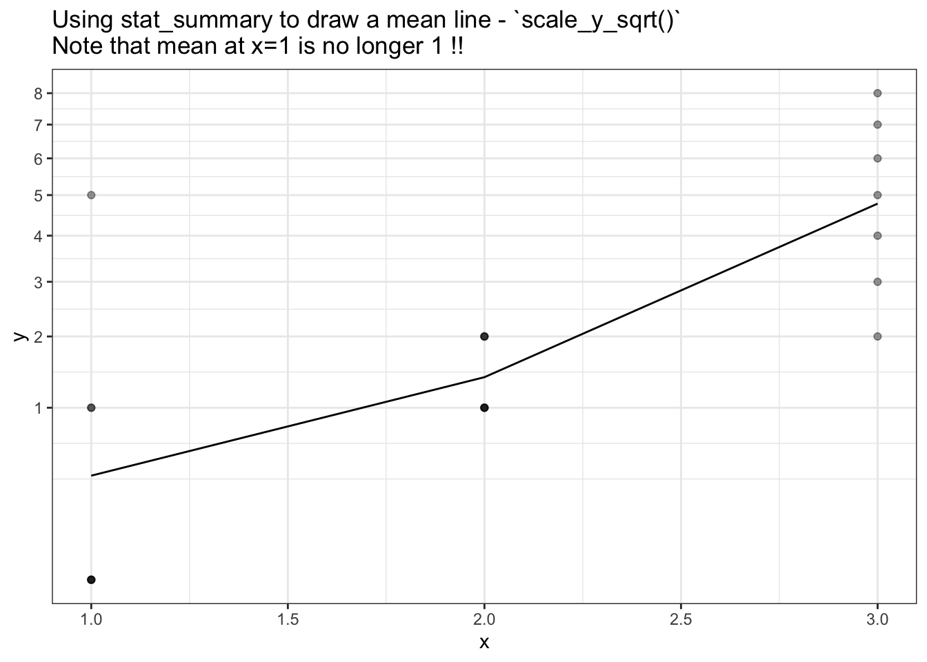
The problem: Summary values are calculated after transform, not before.
My issue with stat_summary is that I would like the summary values to be calcualted before the transform is performed,
but stat_summary summary values are calculated after the data is transformed.
There doesn’t appear to be an option to change this, and I suspect because it’s not in keeping with the grammar of graphics upon which ggplot2 is based.
What’s the different between summary-after-transform and transform-after-summary?
y <- c(0, 0, 0, 0, 1, 1, 5)
sqrt(mean(y)) # transform-after-summary (what i want to do)
[1] 1mean(sqrt(y)) # summary-after-transform (what stat_summary does)[1] 0.6051526What’s the difference on a plot?
So how does stat_summary way of calculating the summary-after-transform differ
from my desired calculation of transform-after-summary?
The following plot shows the correct mean (dashed blue line) and the the stat_summary mean line.
The correct mean has been calculated manually on the original data prior to any transformation.
Note:
- At
x=0the correct mean (blue) passes through 1, whereas thestat_summary()mean (black) passes through 0.6.
ggplot(plot_df, aes(x, y)) +
  geom_point(alpha=0.6) +
  stat_summary(fun.y = mean, geom='line') +
  geom_point(data=mean_df, size=3, alpha=0.3, colour='blue') +
  geom_line (data=mean_df, linetype = 2, colour='blue') +
  scale_y_sqrt(breaks=0:9) +
  ggtitle("Blue dashed line is true mean line (transform-after-summary)\nBlack line is stat_summary result (summary-after-transform)")  +
  theme_bw()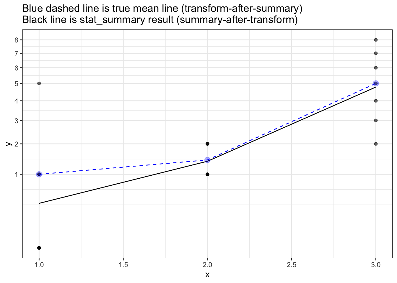
coord_trans() isn’t what I want
I do not want curved lines between points - even though that may be technically correct (the best kind of correct) as the curved lines are not-friendly to the particular non-technical audience.
So the coord_trans() solution below is not acceptable:
ggplot(plot_df, aes(x, y)) +
  geom_point(alpha=0.6) +
  stat_summary(fun.y = mean, geom='line') +
  geom_line (data=mean_df, linetype = 2, colour='blue', size=3, alpha=0.3) +
  ggtitle("Using coord_trans\nBlue dashed line is true mean line (transform-after-summary)\nBlack line is stat_summary result (summary-after-transform)")  +
  theme_bw() +
  coord_trans(y='sqrt')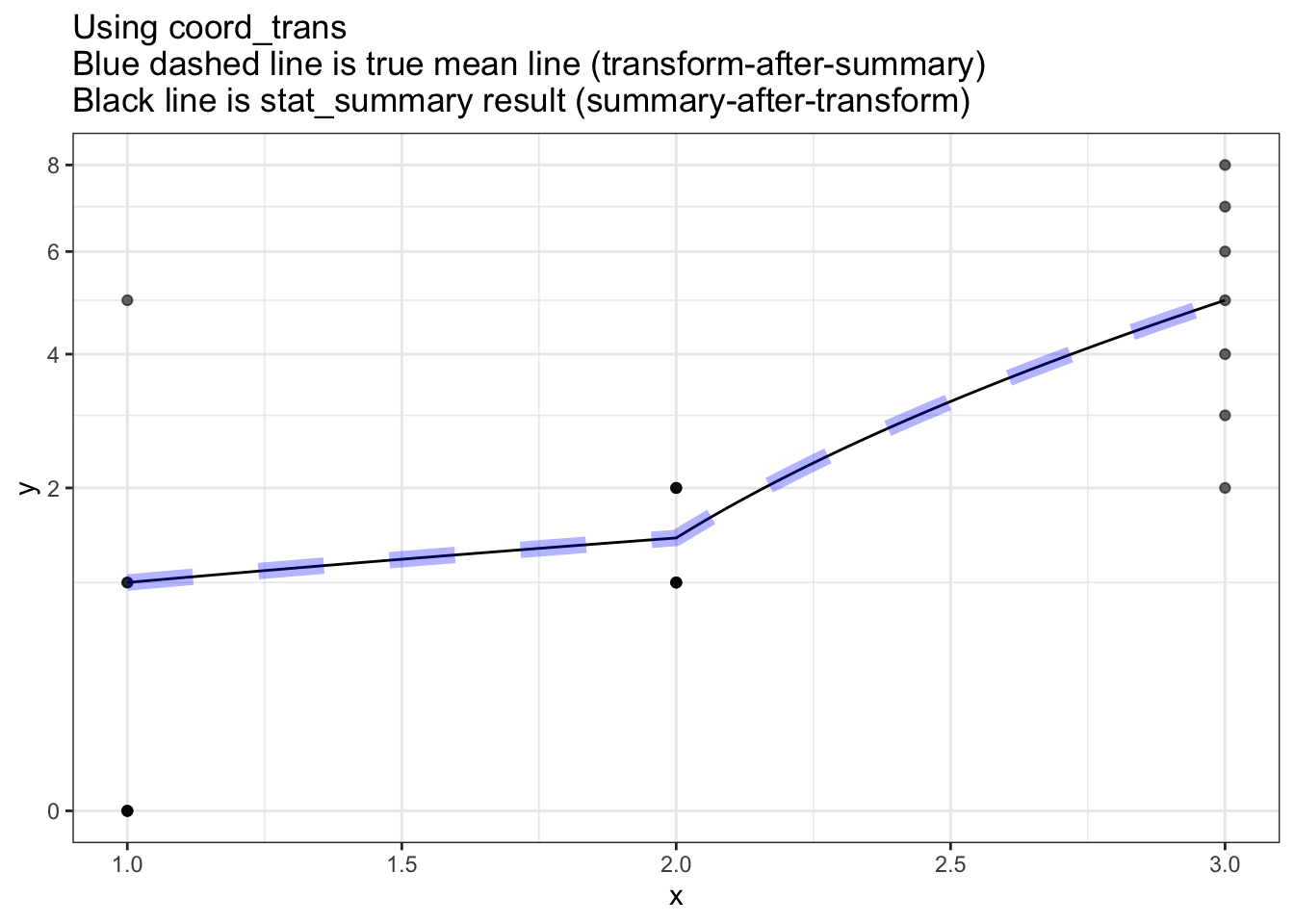
Special/hacked summary function
As proposed on the github issue, a carefully crafted summary function could work in some situations:
library(ggplot2)

plot_df <- data.frame(
  x = rep(1:3, each=7),
  y = c(0, 0, 0, 0, 1, 1, 5,    1, 1, 1, 1, 2, 2, 2,      2, 3, 4, 5, 6, 7, 8)
)


ggplot(plot_df, aes(x, y)) +
  geom_point(alpha=0.4) +
  stat_summary(fun.y = function(x) sqrt(mean(x^2)), geom='line') +
  scale_y_sqrt(breaks=1:9) +
  theme_bw()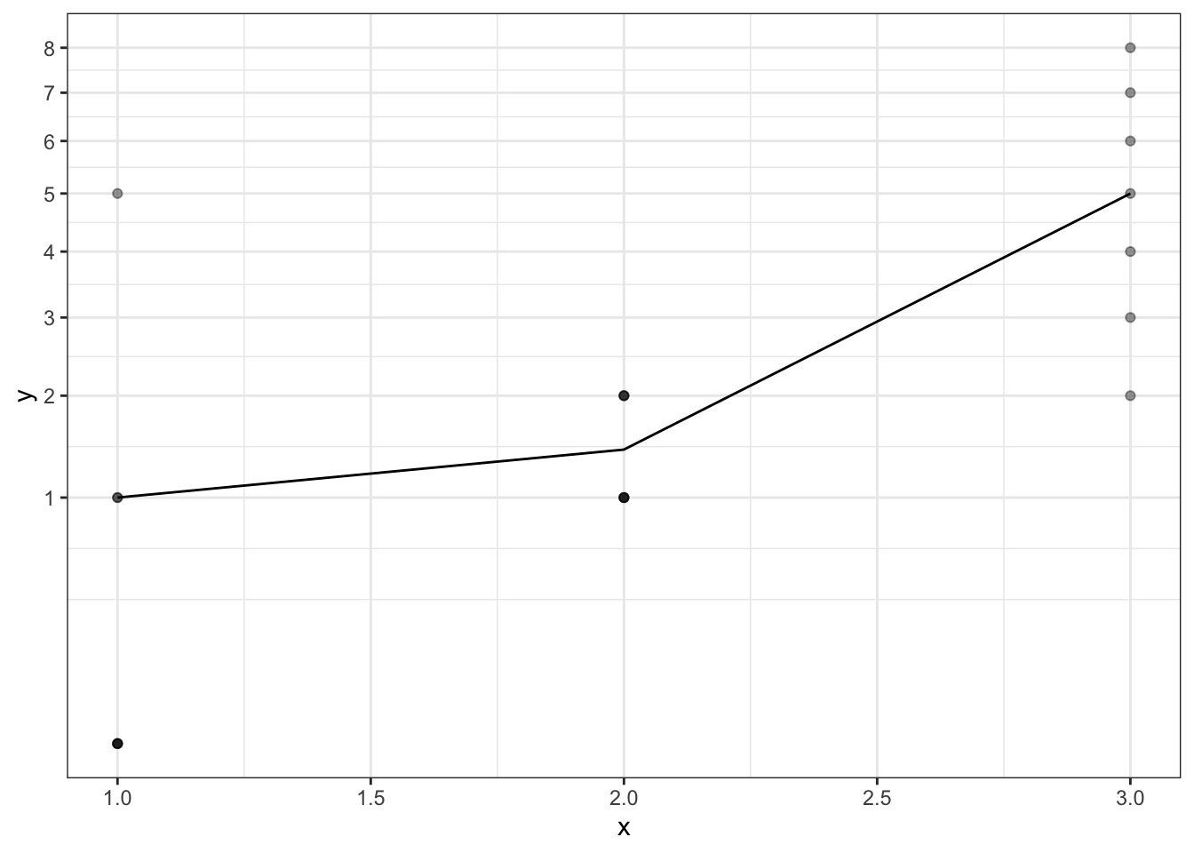
However it is problematic in 2 ways:
- The format of the summary function now depends on the scale uses i.e. the summary function needs to be tailored to the scale transform.
- This won’t work if
- the transform is non-invertible (e.g. sqrt(-2))
- the transform creates infiniteis (e.g. log(0))
The following plot shows that even with a carefully crafted summary function,
the mean displayed will be incorrect because log10(0) is infinite, and
infinite values get discarded by default in Stat$compute_layer.
This means the graph ends up plotting (at x=1) the mean of c(1, 1, 5) which is 2.3.
library(ggplot2)

plot_df <- data.frame(
  x = rep(1:3, each=7),
  y = c(0, 0, 0, 0, 1, 1, 5,    1, 1, 1, 1, 2, 2, 2,      2, 3, 4, 5, 6, 7, 8)
)


ggplot(plot_df, aes(x, y)) +
  geom_point(alpha=0.4) +
  stat_summary(fun.y = function(x) log10(mean(10^x)), geom='line') +
  scale_y_log10(breaks=1:9) +
  theme_bw() +
  ggtitle("With log transforrm\nBecause infinites are dropped in compute_layer\nWe can't recover the original data")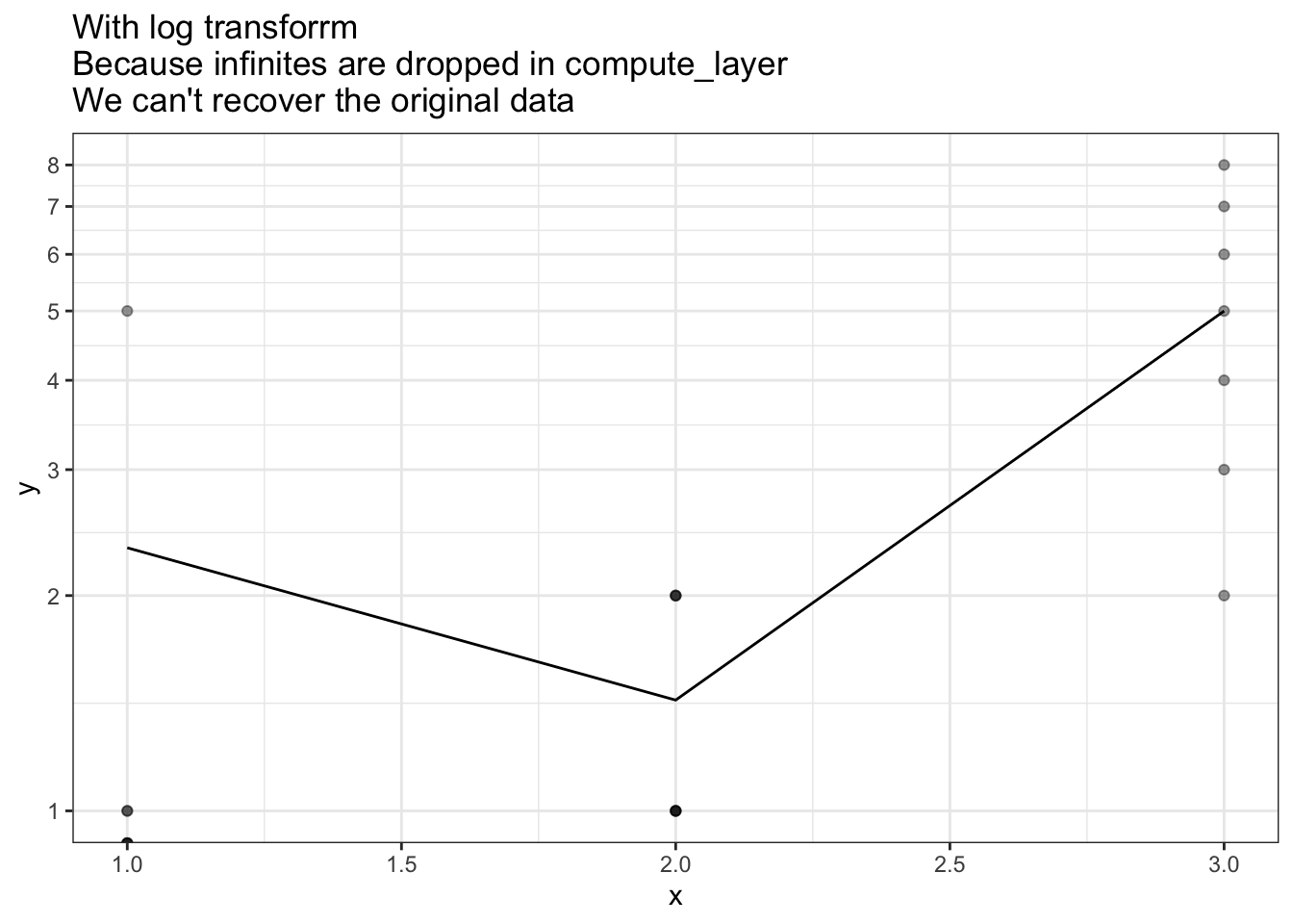
Proposed fix: stat_summary_two - do transform-after-summary
Below is my adapted version of stat_summary - the key user-facing change is the addition transform.after.summary option. This defaults to TRUE, but can be set to FALSE to mimic the behaviour of the original stat_summary.
By the time ggplot processing gets to compute_panel it has already transformed the data. To work around this,
we manually apply the inverse transform to get back the original data. This original data is them summarised and the results
are transformed back into the requested scale.
#~~~~~~~~~~~~~~~~~~~~~~~~~~~~~~~~~~~~~~~~~~~~~~~~~~~~~~~~~~~~~~~~~~~~~~~~~~~~~
#' Summarise y values at unique/binned x
#~~~~~~~~~~~~~~~~~~~~~~~~~~~~~~~~~~~~~~~~~~~~~~~~~~~~~~~~~~~~~~~~~~~~~~~~~~~~~
stat_summary_two <- function(mapping = NULL, data = NULL,
                         geom = "pointrange", position = "identity",
                         ...,
                         fun.data = NULL,
                         fun.y = NULL,
                         fun.ymax = NULL,
                         fun.ymin = NULL,
                         fun.args = list(),
                         na.rm = FALSE,
                         transform.after.summary = TRUE,
                         show.legend = NA,
                         inherit.aes = TRUE) {
  layer(
    data = data,
    mapping = mapping,
    stat = StatSummaryTwo,
    geom = geom,
    position = position,
    show.legend = show.legend,
    inherit.aes = inherit.aes,
    params = list(
      fun.data = fun.data,
      fun.y = fun.y,
      fun.ymax = fun.ymax,
      fun.ymin = fun.ymin,
      fun.args = fun.args,
      na.rm = na.rm,
      transform.after.summary = transform.after.summary,
      ...
    )
  )
}


#~~~~~~~~~~~~~~~~~~~~~~~~~~~~~~~~~~~~~~~~~~~~~~~~~~~~~~~~~~~~~~~~~~~~~~~~~~~~~
# ggproto Stat
#~~~~~~~~~~~~~~~~~~~~~~~~~~~~~~~~~~~~~~~~~~~~~~~~~~~~~~~~~~~~~~~~~~~~~~~~~~~~~
StatSummaryTwo <- ggproto(
  "StatSummaryTwo", Stat,
  required_aes = c("x", "y"),

  compute_panel = function(data, scales, fun.data = NULL, fun.y = NULL,
                           fun.ymax = NULL, fun.ymin = NULL, fun.args = list(),
                           na.rm = FALSE, transform.after.summary = TRUE) {

    #~~~~~~~~~~~~~~~~~~~~~~~~~~~~~~~~~~~~~~~~~~~~~~~~~~~~~~~~~~~~~~~~~~~~~~~~~
    # The `data` we have in this function has already been transformed, so
    # let's untransform it
    #~~~~~~~~~~~~~~~~~~~~~~~~~~~~~~~~~~~~~~~~~~~~~~~~~~~~~~~~~~~~~~~~~~~~~~~~~
    if (transform.after.summary) {
      data$y <- scales$y$trans$inverse(data$y)
    }

    fun <- ggplot2:::make_summary_fun(fun.data, fun.y, fun.ymax, fun.ymin, fun.args)
    res <- ggplot2:::summarise_by_x(data, fun)

    if (transform.after.summary) {
      #~~~~~~~~~~~~~~~~~~~~~~~~~~~~~~~~~~~~~~~~~~~~~~~~~~~~~~~~~~~~~~~~~~~~~~~
      # Transform the summary of the raw data into the final scale
      #~~~~~~~~~~~~~~~~~~~~~~~~~~~~~~~~~~~~~~~~~~~~~~~~~~~~~~~~~~~~~~~~~~~~~~~
      res$y    <- scales$y$trans$transform(res$y)
      res$ymin <- scales$y$trans$transform(res$ymin)
      res$ymax <- scales$y$trans$transform(res$ymax)
    }

    res
  }
)
ggplot(plot_df, aes(x, y)) +
geom_point(alpha=0.6) +
stat_summary(fun.y = mean, geom='line') +
stat_summary_two(fun.y = mean, geom='line', colour='darkgreen', linetype=2) +
scale_y_sqrt(breaks=0:9) +
ggtitle("Green dotted line: correct mean result - `stat_summary_two` (transform-after-summary)\nBlack line: incorrect `stat_summary` result (summary-after-transform)") +
theme_bw()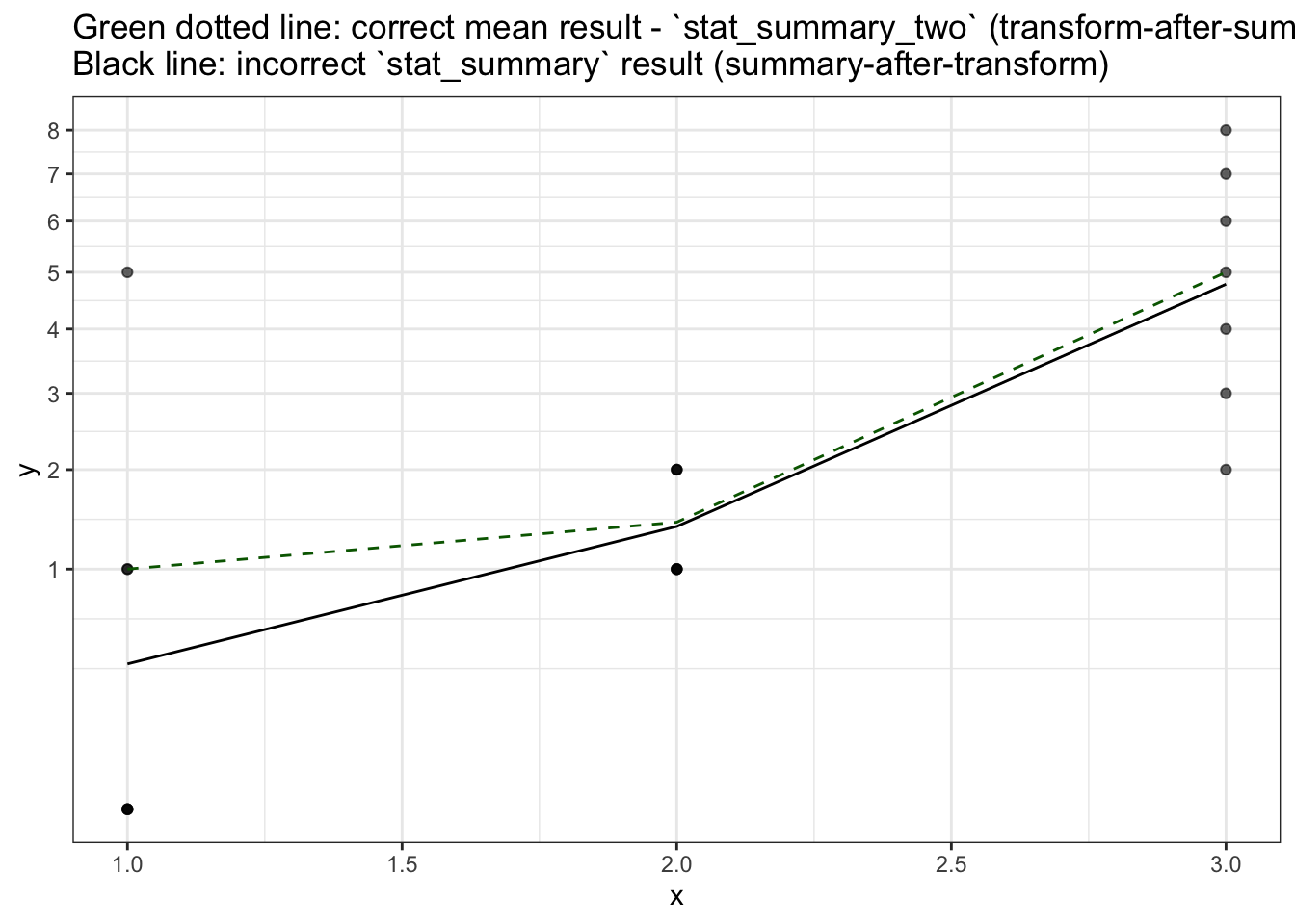
When stat_summary_two will fail
stat_summary_two relies on being able to take the inverse transform to get
back the original data, but that won’t always work.
Consider the following example where a transform followed by its inverse doesn’t get us the original data.
transform <- function(x) {sqrt(x)}
inverse   <- function(x) {x * x}

original <- -2:2
inverse(transform(original))
[1] NaN NaN 0 1 2This means that there can still be original that we cannot recover
to use for the summary calculation in stat_summary_two.
Another proposed fix: make scaling keep original data - stat_summary_three
Below is another version of stat_summary. This version is more robust than
stat_summary_two in that there is no need to inverse transform the data to
get back the original values to summarise.
In this version, scales_transform_df has been changed to keep the original version of any variable that
was transformed.
Again, changes need to be made in StatSummaryThree$compute_panel to ensure the original data is used
(rather than then transformed data) when transform.after.summary=TRUE
scales_transform_df <- function(scales, df) {
  if (ggplot2:::empty(df) || length(scales$scales) == 0) return(df)

  transformed <- unlist(lapply(scales$scales, function(s) s$transform_df(df = df)),
    recursive = FALSE)

  # Keep copies of original/untransformed vars
  varnames <- names(transformed)
  orig <- df[varnames]
  colnames(orig) <- paste(varnames, "orig", sep='.')

  plyr::quickdf(c(transformed, df[setdiff(names(df), names(transformed))], orig))
}

# Inject this function into the ggplot2 package
assignInNamespace("scales_transform_df", scales_transform_df, envir=as.environment("package:ggplot2"))
#~~~~~~~~~~~~~~~~~~~~~~~~~~~~~~~~~~~~~~~~~~~~~~~~~~~~~~~~~~~~~~~~~~~~~~~~~~~~~
#' Summarise y values at unique/binned x
#~~~~~~~~~~~~~~~~~~~~~~~~~~~~~~~~~~~~~~~~~~~~~~~~~~~~~~~~~~~~~~~~~~~~~~~~~~~~~
stat_summary_three <- function(mapping = NULL, data = NULL,
geom = "pointrange", position = "identity",
...,
fun.data = NULL,
fun.y = NULL,
fun.ymax = NULL,
fun.ymin = NULL,
fun.args = list(),
na.rm = FALSE,
transform.after.summary = TRUE,
show.legend = NA,
inherit.aes = TRUE) {
layer(
data = data,
mapping = mapping,
stat = StatSummaryThree,
geom = geom,
position = position,
show.legend = show.legend,
inherit.aes = inherit.aes,
params = list(
fun.data = fun.data,
fun.y = fun.y,
fun.ymax = fun.ymax,
fun.ymin = fun.ymin,
fun.args = fun.args,
na.rm = na.rm,
transform.after.summary = transform.after.summary,
...
)
)
}
#~~~~~~~~~~~~~~~~~~~~~~~~~~~~~~~~~~~~~~~~~~~~~~~~~~~~~~~~~~~~~~~~~~~~~~~~~~~~~
# ggproto Stat
#~~~~~~~~~~~~~~~~~~~~~~~~~~~~~~~~~~~~~~~~~~~~~~~~~~~~~~~~~~~~~~~~~~~~~~~~~~~~~
StatSummaryThree <- ggproto(
"StatSummaryThree", Stat,
required_aes = c("x", "y"),
compute_panel = function(data, scales, fun.data = NULL, fun.y = NULL,
fun.ymax = NULL, fun.ymin = NULL, fun.args = list(),
na.rm = FALSE, transform.after.summary = TRUE) {
#~~~~~~~~~~~~~~~~~~~~~~~~~~~~~~~~~~~~~~~~~~~~~~~~~~~~~~~~~~~~~~~~~~~~~~~~~
# The `data` we have in this function has already been transformed, so
# use the original data (which we kept in `transform_df`)
#~~~~~~~~~~~~~~~~~~~~~~~~~~~~~~~~~~~~~~~~~~~~~~~~~~~~~~~~~~~~~~~~~~~~~~~~~
if (transform.after.summary) {
data$y <- data$y.orig
}
fun <- ggplot2:::make_summary_fun(fun.data, fun.y, fun.ymax, fun.ymin, fun.args)
res <- ggplot2:::summarise_by_x(data, fun)
if (transform.after.summary) {
#~~~~~~~~~~~~~~~~~~~~~~~~~~~~~~~~~~~~~~~~~~~~~~~~~~~~~~~~~~~~~~~~~~~~~~~
# Transform the summary of the raw data into the final scale
#~~~~~~~~~~~~~~~~~~~~~~~~~~~~~~~~~~~~~~~~~~~~~~~~~~~~~~~~~~~~~~~~~~~~~~~
res$y <- scales$y$trans$transform(res$y)
res$ymin <- scales$y$trans$transform(res$ymin)
res$ymax <- scales$y$trans$transform(res$ymax)
}
res
}
)ggplot(plot_df, aes(x, y)) +
geom_point(alpha=0.6) +
stat_summary(fun.y = mean, geom='line') +
stat_summary_three(fun.y = mean, geom='line', colour='darkgreen', linetype=2) +
scale_y_sqrt(breaks=0:9) +
ggtitle("Green dotted line: correct mean result - `stat_summary_three` (transform-after-summary)\nBlack line: incorrect `stat_summary` result (summary-after-transform)") +
theme_bw()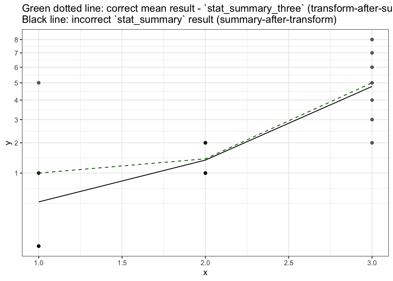
Summary
- It’d be nice to have summary stats work on original data rather than transformed data.
Appendix: Data
#~~~~~~~~~~~~~~~~~~~~~~~~~~~~~~~~~~~~~~~~~~~~~~~~~~~~~~~~~~~~~~~~~~~~~~~~~~~~~
# Create the plotting data.frame
#~~~~~~~~~~~~~~~~~~~~~~~~~~~~~~~~~~~~~~~~~~~~~~~~~~~~~~~~~~~~~~~~~~~~~~~~~~~~~
plot_df <- data.frame(
  x = rep(1:3, each=7),
  y = c(0, 0, 0, 0, 1, 1, 5,    1, 1, 1, 1, 2, 2, 2,      2, 3, 4, 5, 6, 7, 8)
)


#~~~~~~~~~~~~~~~~~~~~~~~~~~~~~~~~~~~~~~~~~~~~~~~~~~~~~~~~~~~~~~~~~~~~~~~~~~~~~
# Calculate the median at each time point
#~~~~~~~~~~~~~~~~~~~~~~~~~~~~~~~~~~~~~~~~~~~~~~~~~~~~~~~~~~~~~~~~~~~~~~~~~~~~~
mean_df <- plot_df %>%
  group_by(x) %>%
  summarise(
    y = mean(y),
  ) %>%
ungroup()| x | y |
|---|---|
| 1 | 0 |
| 1 | 0 |
| 1 | 0 |
| 1 | 0 |
| 1 | 1 |
| 1 | 1 |
| 1 | 5 |
| 2 | 1 |
| 2 | 1 |
| 2 | 1 |
| 2 | 1 |
| 2 | 2 |
| 2 | 2 |
| 2 | 2 |
| 3 | 2 |
| 3 | 3 |
| 3 | 4 |
| 3 | 5 |
| 3 | 6 |
| 3 | 7 |
| x | y |
|---|---|
| 1 | 1.000000 |
| 2 | 1.428571 |
| 3 | 5.000000 |